Animation Fields and Field Sizes

Animation Fields and Field Sizes


In 2D animation, centimetres and inches are used to specify distances and lengths, but there is another measurement system used unique to animation: fields.

A field is a measurement of area rather than length; think of a field as being the shape of a TV screen. A drawing that is 1 field in size will be a small rectangle that is one inch across and about .75 inches high. A 6 field drawing will be 6 inches across, and so on.

Let's start by looking at how the size and framing of animation drawings are specified. It is important that everyone working on an animated production knows this. There are standard ways of achieving this very easily.

To create 2D drawn animation, you use punched paper which sits on a pegbar for registration.


In the UK, “Acme” pegs are used – these are the familiar two slot shaped holes and one round hole as shown in the illustration below. In the examples to follow, the peg holes are at the bottom of the paper so are called "bottom pegged”.

Let us suppose that you are ready to animate. You have a pile of punched paper and a lightbox on which to work complete with a pegbar.
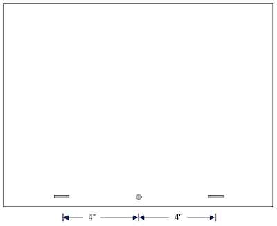


Each sheet of paper will look something like this:


Where is the actual drawing area? The animation paper is blank, so there is no initial clue as to where the edges of the drawing should be.


[For the time being, assume you are going to produce animation in the normal TV screen shape and not the letterbox (widescreen) shape.This will be dealt with later].


Below, the illustration indicates a normal drawing area together with some dimensions in inches.


There are three things you need in order to accurately describe the size and position of an animation drawing:

its shape
its size
the location of its centre


The shape of the example shown above is 4 x 3 which means it is 4 units across by 3 high. (4 x 3 = four by three).

Size: animation drawings are made to certain fixed field sizes, usually between 3 and 12 inches.
The size of the drawing above is 12 field (written as 12F) – this means it is 12 inches wide and roughly 8.85 inches high (roughly 4 x 3). A 6Fdrawing would be 6 inches across, and so on.

The actual size you make your drawings when you animate is a matter of personal choice. The 12F size is commonly used in the UK for TV production so is a sort of default size; you may feel more comfortable working at, say an 8F instead. There are also larger standard field sizes in animation, mostly used for cinema work where greater accuracy of drawing is needed. The largest commonly used field size is probably 16F, (mostly used in the USA). The shape, on the other hand is entirely dependent on the final means of transmission; if it's a piece of animation for the Internet, the shape is arbitary, but for television or cinema use, you must work to the shape of the screen that the animation will be seen on.

Its centre is located 5.75 inches immediately above the centre of the round peg hole.
In the illustration below, the cross marks the centre of the drawing area - and that is the same as the centre of the animation when it is seen by the viewer.
You can also think of the cross as representing the middle point of the viewfinder of the camera that will be used to film your animation. Nowadays, of course, a real camera may never be used to film the animation, but you will find that almost all professional animation programs will continue to use the term "camera" as it makes life a lot easier.
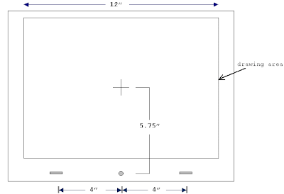


The cross is the centre of your drawing area and it is also the centre of the camera's viewfinder. It is therefore the centre of the final image as it will appear when it is broadcast or projected.

ALWAYS specify the centre of all artwork, preferably with a drawing, unless it is at the default centre as seen above; in this instance you can specify it by writing on the dopesheet that the size is :


This stands for "12 field centre", the crossed "C" signifying the Academy centre. (The crossed C can be used with any field size, not just 12, of course).

The easiest way to produce your work at a standard size (and of knowing where the centre is) is by getting your hands on an animation graticule (also called a field chart). Normally these show all the field sizes from 1F to 12F

A typical 12F Academy Field Chart:

Hopefully, the above should now be obvious as to its design and use. Field charts printed on acetate are available from animation supply companies.

There are also field charts available for larger field sizes. Unfortunately, if you are working in 4 x 3 shape, the centre cannot stay the same for larger field sizes as you would find that the pegbar would have to be placed within the artwork area. There are therefore different standard centres for larger field sizes.

An added complication nowadays is the need to produce animation for widescreen (also called "letterbox") shape. In fact, if you work on a 15F widescreen, you can keep to the standard 12F centre.

The simplest way to avoid all possible confusion is: draw a camera guide!

The basic widescreen shape is 16 x 9 and when you animate for that shape, you should act as though your field chart is the shape below:

I am not aware of these being available commercially; however, if you have a look at the notes on this site about designing for widescreen, it should be obvious how to deal with the matter. The real problem is in making sure that animation will work in 4 x 3 shape and 16 x 9 shape and sometimes also the compromise 14 x 9 shape and these notes will explain how to cope.

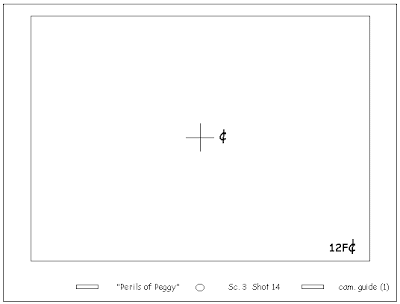
Note: whether you are working in 16 x 9 shape or 4 x 3, if the distance between the chart centre to the pegs is the standard distance 5.75 inches, you can use the crossed C to indicate it is centred; if you place the centre anywhere else, specify where the centre is with a drawing (a camera guide) and do not use the crossed C symbol

A basic camera guide should look something like this:

Sanjay Patel - Animator

Sanjay Patel is an animator and storyboard artist at Pixar Animation Studios. He spends a lot of time looking for taquerias that will serve him french fries along with his burritos. He was born in England and raised in L.S. but has never been to India.


Website


Film Directing SHOTS

One of the most over used cliches in film is "The Shots are all you have." Film Directing SHOTS: The following are what you need to think about practically so you can think creatively and device the best shot list you possibly can:


QUESTIONS TO ASK?
-What is the best viewpoint for filming this position of the event?
-How much area should be included in this shot?

SCENE - Defines the place or setting where the action is laid
SHOT - Defines a continuous view filmed by one camera without interuption
SEQUENCE - A series of scenes or shot complete in itself


TYPES OF CAMERA ANGLES
OBJECTIVE - The audience point of view
SUBJECTIVE - The camera acts as the viewers eyes-movement
POINT OF VIEW - What the character is seeing


SIX BASIC SHOTS

1) Extreme Long Shot
Taken at a great distance. Almost always an exterior shot and shows much of the locale. Used a lot in Establishing shots

2) Long Shot
The distance between the audience and the stage in the live theatre

3) Full Shot
Barely including the whole body

4) Medium Shot
Knees to waste up. Useful for exposition scenes, carrying movement and for dialogue

5) Close Up
Concentrates on a relatively small object. HUMAN FACE

6) Extreme Close-Up
Might just show eyes or mouth


CAMERA ANGLES

Are the most important factor in producing illusion of scenic depth.Which angle the object is photographed.


FIVE BASIC ANGLES

EYE LEVEL SHOTS- Provide frames of reference. Audience sees the event as if the scene happening right in front of them. Most scenes in movies are photographed from eye level. 5 to 6 feet off the ground. Capturing the clearest view of an object
-Used to treat your characters as equals. Discourages viewers at judging them. Permits audience to make up their own mind.

BIRDS EYE VIEW- Photographing a scene from DIRECTLY OVERHEAD. Hovers from ABOVE like all powerful gods. IDEA OF FATE

HIGH ANGLED SHOTS- Camera is tilted downward. Besides the obvious power shot, movement is slowed down during fast moving action. Ground is in the background. A person seems harmless and insignificant is photographed from above.
-The higher the angle, the more it tends to imply fatality

LOW ANGLES SHOTS- Camera it titled upwards. Use to inspire awe or excitement. Motion in speeded up. Environment is usually minimized. Sky or ceiling is background.
-Heightens the importance of a subject. Scenes depicting heroism

OBLIQUE ANGLE- Lateral tilt of the camera. As though the object is about to fall to one side. Point of view shots. Suggests tension, transitions, impending movement
-Image that slants to the right – Acting Forceful
-Image that slants to the left – Weak, Static


ASK YOURSELF

-How much should be included in this shot?
-Where should the camera be positioned to view this particular part of the action?

A SHOT SHOULD BE HELD NO LONGER THAN REQUIRED TO MAKE ITS POINT

Approach each sequence with a fresh attitude and strive to treat the action in an individual matter.

A definite change in camera angles will assure a smother flow of images


CLOSE-UPS

-Among the most powerful storytelling devices available to the filmmaker
-Allows removal of tedious or repetitious action
-Can be used to provide a time laspe
-Brings that dramatic punch

FRAMES-Area near the top of the frame can suggest ideas dealing with power, authority and apiration
-Left and right edges of the frame can suggest insignificance
-Dominant Contrast - Area the immediately attracts our attention because of a conspicuous and compelling contrast
-Subsidiary Contrast - Structured image so that specific images are followed in sequence

THE HUMAN EYE SCANS PICTURES FROM LEFT TO RIGHT

HORIZONTAL LINES - MOVE FROM LEFT TO RIGHT
VERTICAL LINES - MOVE FROM TOP TO BOTTOM

DIAGONAL OR OBLIQUE LINES tend to sweep upward

TERRITORIAL SPACE - Movie images must tell a story in time, a story that involves human beings and their problems

THREE VISUAL PLACES

-Midground
-Foreground
-Background

CRUCIAL DECISION - How much detail should be included within the frame?

HOW CLOSE SHOULD WE GET TO THE SUBJECT?
-How much space is just right for the shot?
-What’s too much or too little


AN ACTOR CAN BE PHOTOGRAPHED IN FIVE BASIC POSITION

1) Full Front - Facing the camera
-Most intimate, vulnerabilities exposed
-Audience agrees to become his chosen confidante

2) Quarter Turn
-Involves a high degree of intimacy but with less emotional involvement

3) PROFILE - Looking off frame, left to right
-Character lost in their own thoughts

4) Three Quarter Turn
-More anonymous. Rejecting audiences

5) Back to Camera-Characters alienation from the world. Sense of concealment, mystery

Tightly framed shots - CONFINED

Loosely framed shots - FREEDOM


USING SPACE IN FOUR WAYS

1)INTIMATE
Eighteen inches away. Distance of LOVE, COMFORT, TENDERNESS between individuals

2)PERSONAL
-Eighteen inches to about four feet away. Reserved for friends and acquaintances

3)SOCIAL
-Four feet to about twelve feet away. Business and casual social gatherings

4)PUBLIC

-Twelve to about twenty feet away

Storyboards - Movie Storyboard and What is a Storyboard Artist

STORYBOARDS AND WHAT IS A STORYBOARD ARTIST
By Matthew Taylor
(Matthew Taylor is an independent film director, screenwriter and professional storyboard artist currently living in Toronto, Canada.)

“History of Storyboards”

During the filming of his legendary movie “Hell’s Angels”, producer, director, and aviator Howard Hughes was faced with addressing the first multi-million dollar budget in film history, the advent of sound in film, the use of multicolor, and most importantly to his mind, how to shoot one of the most dynamic and outrageously dangerous scenes in cinematic history. Scenes involving the recreation of the glorious air battles that were fought over the skies of WWI Europe. Hughes, if anything was the master of the long-term plan and in order to succeed with bringing this, and his vision to the screen, he needed to lay his master plan out clearly; as much for himself, for his own clarity and hierarchy of needs, as for his entire production crew. This is arguably where the first sequential storyboards were used in motion pictures.

Of course, up until this time, singular artistic impressions, sketches, production designs and illustrations for film were in full use but none so far had been developed into framed continuous order, a blue print for the film before-it-was-filmed. And Hugh’s Hell’s Angels was a unique situation that demanded its precise arrangement and balance between story, action, effects, screen direction, cost concerns, teamwork and safety to be clearly stated (safety fell tragically short of the mark as three stunt pilots died and Hughes himself flew the final sequences when others refused). But from this point on the storyboard was to become an integral part of a great many film director’s vernacular and process. As an example, years later, renowned for his precise directorial style, Alfred Hitchcock would also pick up the pencil and use the storyboarding process to solidify his vision for most if not all of his feature films. Having studied art and illustration, and beginning his film career working as an Art Director, Hitchcock had become a sharp draftsman and visualist, thus allowing him to draw many of his own storyboards to a high degree of refinement. Some might say the boards themselves were works of art. This was the perfect synthesis between the director as storyteller, the script, and the final film.

Others too, had similar backgrounds and found the process a natural one. Ridley Scott: art school, illustration, art director, then director. His storyboards were to become so synonymous with his filmmaking that they would affectionately be known and referred to by his crew as the “Ridley-O-Grams”. Terry Gilliam was also an illustrator and animator and his storyboards can be found attached to almost all of the DVDs of his films today, as part of “the making of” or extras features. His drawing style uses a loose, comical technique, perfect to convey his whimsical, mad aesthetic, which informs much of the images and angles found in all of his films, not least of which, the film Brazil.

In the arena of animation, Director Brad Bird, perhaps illustrates the full circle of storyboarding and the degree to which the process can be taken. After years of training as a storyboard artist at Disney, schooled through the Disney process of storytelling through character, Bird’s feature film debut as writer-director was The Iron Giant and later the hit film The Incredibles, both highly creative and successful films. The process of storyboarding for the latter actually became the writing process whereby the story meetings and pitch sessions were used to find the film through drawing it as they went, allowing the story to evolve before them.

As some screenwriters say, “writing is re-writing”, Brad Bird echoes that sentiment within his own variation, “Storyboarding is re-storyboarding”. And for the live action film director—the context of this article—re-storyboarding, can save much gnashing of teeth and heartache (i.e.: money and time) by avoiding…re-shooting. Or worse, not achieving the shot, scene, sequence or film you originally envisioned.

On a final note to this brief history of storyboarding: To my mind, the truly first storyboard artist where working away in the caves of Lascaux, France during the Upper Paleolithic Period. Painting their story in graphic terms on the rock walls in a sequence of events, around characters, the hunt, the change of day, migration, all in order to visualize things as they where or things as they where to be. It gets better. Most recently, and quite amazingly, science made an additional discovery: the actual locations of the paintings themselves were all at points of highest acoustical effect within he cave system suggesting, therefore, they were either chanting or singing while drawing or perhaps even while viewing the cave art. Seems like a soundtrack to me!
When Pablo Picasso first laid eyes on these cave walls and their drawings he said, “we have invented nothing!”


“They Could Draw, But I Can’t!”

I’ve talked about some heavy hitters and big films no doubt. But since this is an article written for the independent filmmaker/director I will make the assumption that there is little to no budget with which to hire a professional storyboard artist. And they can be expensive! Therefore you’ll be relying on your own skills and many might feel that in order to storyboard you have to maintain a comic book artist or illustrator’s skills in order to do it effectively. This can’t be further from the truth in my estimation.

Where it is true that a little graphic hand-eye skill can be helpful, it really relates to time. It takes time to draw highly refined, detailed boards regardless of your skill level and that is not cost effective unless you have money with which to buy the time you need. When you storyboard, or hire a storyboard artist, you are manipulating time by condensing the communication process to a pictorial simplification of a multitude of complicated factors. This can be achieved, in many cases, as simply as….a cave drawing. But in an aspect ratio.
For example, Martin Scorsese drew his own boards for Taxi Driver. That was a manic production schedule. His (storyboards) were stick figures. Literally. But, the films Cinematography, Michael Chapman (who equally needs little introduction) was quoted as saying that they were the best boards with which to work. Simple, to the point. They told the story and got out of the way.

There is also this to discuss. I worked as a camera assistant myself for a number of years and once, speaking to a now-A-list camera operator, we were discussing storyboards. He had worked with incredibly well drawn comic book-like storyboards before and wasn’t sold by their wow factor. He said this, “I’m an filmmaker too. What I do. When the boards are picture-perfect, where does my interpretation fit in?” I thought he made quite a valid point. Just enough and not too much, leaves room for the other collaborators to feel free to have their own feelings, ideas and thoughts about the film you’re making. And this can only make the film better.

If you’re still not convinced (there must be some ‘auteurs’ out there) I would suggest taking a life drawing course. My life-drawing instructor said to me, “the human body has every form in nature that you can draw”. He meant the circle, the S-curve and the perceived straight line. He continued, “If you can draw the human form, you can draw anything”. I would also suggest find a place that offers quick-sketching life drawing (short poses 1 to five minute posses) to develop speed and intuition. And the very basic of perspective drawing: One, two and three-point perspective.

The Disney life-drawing instructor, Glenn Vilppu, has a stellar series of books and DVDs online. I think his method and materials are an excellent starting point.


“What Can I Achieve With Storyboards”

  1. Cost effective, accurate planning
  2. Perceive possible continuity problems before they happen
  3. Communication between departments
  4. By having a plan, you can take advantage of “happy accidents” during filming and stay within the necessities of the scene.
  5. Show by doing: convince yourself and others of the soundness of your concepts and ideas. If that doesn’t work, get new ones.
  6. Storyboards can be a way for Directors to “rehearse” themselves. Or “doing the homework.”
  7. Artistic and aesthetic vision remains consistent. Or inconsistent, but by design.
  8. Screen direction (a very little talked about or acknowledge subject)
  9. Stunts and special equipment planning
  10. Special effects, CGI, etc
  11. Develop a style by “in camera” edits as opposed to adhering to standard coverage.
  12. Sales tool for funding.
  13. Simple inspiration. The ‘what if’ factor for all creative heads.
  14. The freedom to experiment without causing the producer to stroke-out


“A Thought For The Storyboard Artists”

Those 14 advantages above are just a few off the top of my head. But I would say, in a word directly to potential storyboard artists, beyond the obvious technical advantages that a storyboard artist brings to a production there are also the intangible factors. In my experience as a storyboard artist I have, at times, forged strong bonds with directors. A storyboard artist works very closely with a director and during periods of great pressure, most especially on tighter budgeted films. The good storyboard artist is not the person who comes out of their basement, a brilliant but strange, reclusive artist, imposing their habits, nuances and maybe film knowledge. Rather, it is about being malleable, receptive and a medium for someone else’s expression of creativity and vision. It’s a very supportive and therefore privileged place to be in film. Only then can you say you’ve “collaborated” on a film as a board artist and I would suggest that the boards themselves—regardless of draftsmanship—should reflect that successfully.

The other suggestion would be to find a way to work for a while on set. You will discover the language of production and be able to infuse your work with the controlling factors of filmmaking. From the floor up. Furthermore, Producers will also feel more inclined to hire you given that your boards won’t be flights of fancy but will reflect the concerns for which, in the end, they are responsible.

Even if your boards don’t improve from this artistically, your communication with directors certainly will, and you can get to drawing faster and that builds skill. In the end, Storyboards are just one step in many that bring the necessary cohesion of like-minds to focus on a picture.


“Let The Games Begin”

Almost every director, at some point, draws a film frame to illustrate an idea. The storyboard happens with the last frame, the one finishing their idea, is drawn. The in between is the telling. This is all you need to get started. But to develop shooting boards, ones that you can take to the floor and film, you need to have lined up certain basic elements.
  1. Location. Either with digital photos, sketches or overhead plan-view, have your location and sets at the ready.
  2. Develop an overhead view (like an architects diagram) of your blocking and staging. Use symbols for camera, character and elements.
  3. By understanding the geographic and architectural constraints you’ll be establishing your boards within a dramatic context and you wouldn’t have to resort to a series of talking heads.
  4. By combining both storyboards and over-head plans of camera movement etc—on the same page—you will be able to fill out in broad terms a clear series of images that will help to explain your intentions. Each can explain the other, should clarity wane.
  5. Before you draw a single frame, let your mind wander over the pictures you have, the diagrams and drawings. This is rehearsal.
  6. Draw this as though watching an ant colony.
  7. Draw your camera angles.
  8. Then you can begin by drawing rough sketches (later to finish) or draw the frames of what you have seen your cameras capture.
  9. Add footnotes to help explain either of these two elements. You now have three elements with which to explain your ideas: Frames, Plan view, Notes
  10. Find inspiration from all around you. Art, Photography, magazines, comics, whatever it takes to create a series of frames that expresses your story but also your dramatic intent.

This is just the start, there are dozens of other approaches, a wide variety of tricks -of-the-trades (blue penciling, photocopying, duplicating etc), which are time savers and other approaches, but the fundamentals are really quite basic. You simply draw, as directors, the story you see as the script takes it affect. The effectiveness of your storyboards occurs when others see the same story. To dive further into the process there are dozens of trade books and DVD extra features to watch. But like anything, you learning by doing.

The Following storyboards are from various productions on which I’ve worked. I’m going to show you the bumps and bruises in order show process as well and try and illustrate some of the ideas and points I’ve been writing about. To end, I’d like to paraphrase Alfred Hitchcock: You have a frame. Close your eyes and fill it.


The Following is a Set of Storyboards drawn for a Car Crash on a Film


Don Bluth's - Storyboard Notes

Don Bluth's Animation Academy
How we Storyboard
Building the storyboard is an integral part of putting together an animated feature. The process provides not only a visual interpretation of the script, it also allows designers in each department to get a feel for what is being presented on screen.


Creating the visual story composed of consecutive storysketch panels that depict the action and staging of the film's script is the first step in the animation production process. The concepts and timing intiated here will be built upon by twenty or more departments, converting them into a final full color film. The storyboard is the basic game plan, the vision of continuity that will drive the entire production.
Storyboarding involves working from a film script to set a story down in picture or illustration form; rather like a comic book. The storyboard functions as the blueprint of an animated picture. The following is a breakdown of the story-sketch artist's set up, and the thought and drawing processes involved.


EQUIPMENT

PENCILS

  • Whatever the individual feels comfortable with. Anything from an HB to a 6B depending on the quality of the line and darkness of shadow required

PAPER

  • 8.5 x 11, standard white

FIELD GUIDE

  • Story sketches are drawn to a standard 8 field size (5.5 x 10.25). This is traced down on the paper and represents the screen edge all around. Significant details will occasionally be drawn outside this cutoff since all production artwork is finished out to the edge of the paper. Wide screen projects will have altered field sizes and measurements.

XEROX™ MACHINE WITH VARIABLE SIZE CAPABILITY

  • It is frequently necessary to enlarge or reduce artwork to specific sizes, both to save time and for cutting purposes. Final approved boards are then enlarged or reduced to proper production size.

CHAIR

DESK

  • Any comfortable desk will suffice. An animation disk is not necessary, though backlight is sometimes useful.

OVERHEAD LIGHT

PENCIL SHARPENER

PIN-UP BOARDS

  • For displaying sketches in continuity.

PUSH PINS

  • To pin up sketches

X-ACTO™ BLADE

  • For cutting xerox copies before revising.

ERASERS

  • Plastic or kneaded soft eraser: the plastic for getting rid of drawings completely, the soft for lightening lines.

MODEL SHEETS AND REFERENCE

  • as needed.

It is also important to keep your work area neat and easily accessible. Keep the desk functional and as uncluttered as possible. Reference material should be pinned up or displayed for use as you draw.

THOUGHT PROCESSES

There is also a method for the thought process when creating boards. Consult your Director to find out as much as you can regarding your sequence. Story sketch, if done properly, looks easy, but the thinking involved is complex.

THINGS TO BE AWARE OF:

  1. PLOT POINTS: Learn the script and how to differentiate between significant pivital action on which the plot hinges and entertaining business. When in doubt - CONSULT YOUR DIRECTOR.
  2. ENTERTAINMENT: Does the scene possess entertainment value...drama, humor, shock, fear, endearment, etc?
  3. SETTING: Where does the action take place? Desert or forest or ocean...etc.what time is it? Again, when in doubt, consult your Director - and your script.
  4. STAGING: Where are the characters in relation to one another? What is the action and how can it be conveyed in the simplest, most direct way possible? When in doubt, consult your Director.
  5. CUTTING: This can be very elusive. It involves some of the elements of staging, that is, awareness of action and character placement, but it also involves the pacing and how various effects are achieved.

For example:

These scenes all relate to one another, being various distances from the same object, but they affect us differently depending on their order. Trainees should study film techniques closely from books and films. Again, when in doubt, consult your Director.

NECESSARY DRAWING SKILLS

CHARACTER DRAWING

  • In order to get the film's characters to act and behave as you wish, a thorough understanding of their construction and proportions is necessary. Also, since we film everything from mice to humans, it is necessary to understand character size relationships, both to one another and to the setting.

PERSPECTIVES

  • A thorough understanding of perspective is important for creating the illusion of three dimension in a sketch. Without it, scale is impossible to convey. A close study of books and layout drawings is critical here.

DESIGN

  • A knowledge of design principles is just as important as a grasp of character drawing and perspective. It makes all the difference between excellent and mediocre storysketching. You will be drilled regularly in all of these aspects of drawing. Skills will vary from one trainee to another, as will difficulty of assignments. The same as with all other matters of great import, when in doubt, CONSULT YOUR DIRECTOR (and even when not in doubt).

This is the standard form most story sketches will take. This will differ slightly from vertical and horizontal pan moves, diagonal moves and camera trucks.

PLEASE NOTE: These last four examples involve special camera moves. These should be written on the sketch wherever they will not interfere with the drawing, i.e. outside the field guide.
Any special instructions involving characters, special effects animation or the set should be written inside the field guide, but judiciously, so as to avoid obscuring the drawing.

This is a rough outline of the craft of story sketch. Be patient with yourself. It takes time to master all aspects of this job and develop the judgment necessary to excel.

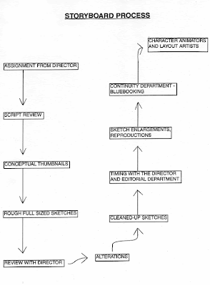
METHOD ANALYSIS - STORY SKETCH

  1. Report to your Director.
  2. Discuss the sequence of script you will be working on, to iron out any problems and get a firm picture of what the Director wants to achieve.
  3. If requested by the Director, plan the sequence as small thumbnail sketches (no larger than 4 x 5) to work out staging and cutting. This may sometimes be necessary. If so, return to Director before going ahead.
  4. Return to Desk.
  5. Using all reference, including script and thumbnail sketches, work on full-size sketches, utilizing format described in the introduction section. These should be left in a rough state until the Director makes his judgement as to whether they are working. However, sketches should be complete enough that all different characters and important background details are distinguishable. Notes should also be written and properly placed.
  6. Sequence is now completed in rough state and should be presented to the Director and any instruction changes he deems necessary should be in notes.
  7. Return to desk and make necessary changes. Be patient because this stage may be repeated as many times as necessary to please the director.
  8. When the Director has approved final changes, sketches should be brought to completed stage. Bear in mind your drawings must hold up under repeated xeroxing, including enlargement to production size, and reduction to storyboard size. All writing and drawing must read, so lines must be crisp.
  9. Boards are now ready to be timed. Here again, the Director has ideas in mind which the story-sketch artist must grasp thoroughly to complete the job.
  10. Footage for all sketches is noted on a round sticker at the top right corner of the story sketch, just inside the field cutoff.
  11. After all notes and final touches are completed, the board should be presented to the Continuity Department for duplication and work preparation.
  12. Note total footage of sequence for entry on your weekly report. This will be credited to you once final approval is official and your sketches have been reduced and pasted up as a finished storyboard.
  13. Clear your desk of all extraneous matter, including discarded drawings and scraps, except for necessary reference materials and tools.
  14. Report to your Director for new assignment.

KEY POINTS

  • A SEQUENCE consists of a series of SCENES which follow a particular event from beginning to conclusion. In live action, a sequence is generally termed a scene, while what we call a scene is a shot.
  • Be patient and consult the Director frequently. Story sketch is a refining process and bull sessions will improve your work.
  • One foot of film equals 16 frames or two-thirds of a second (the amount of time it takes for 16 frames to travel through to projector). The footage numbers are noted in base 16, with the remainder noted to the right. Thus:

one foot = 1-00 or 16 frames

two feet = 2-00 or 32 frames

one and one-half feet = 1-08 or 24 frames (1 second)

  • PLEASE NOTE: The story is constantly being amended. Changes will continue to be made as necessary to the benefit of the picture. No storyboard is truly completed until the sequence is in final color, and even then there are occasional alterations.

Brad Bird Composition Note - 2


Brad Bird on Composition Part-2 PDF